2023
UX Design, UI Design
I was the lead UX designer in a cross-functional agile team of 15:
along with engineers, a PM, and supporting graphic designers.
I was responsible for the overall design direction, from research to
analysis to rebuilding a brand-new version of the app from scratch.
Inconsistent experience, usability and interaction design
problems
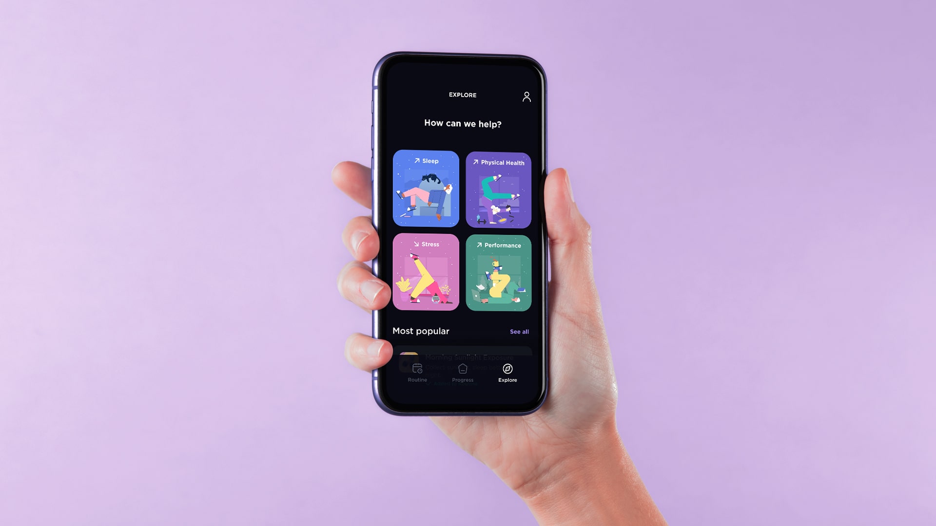
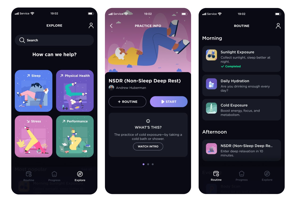
Virtusan is a science-based platform that supports the mental and
physical health of its users through preventative and therapeutic
solutions centered around 4 main pillars: Sleep, Stress,
Productivity and Physical Health.
It offers features (formerly "Journeys," now "Practices") to improve
your health that you can add to form a personal routine. This was unique to us.
But users didn't understand that due to navigation issues and lack of context.
User Retention & User expansion
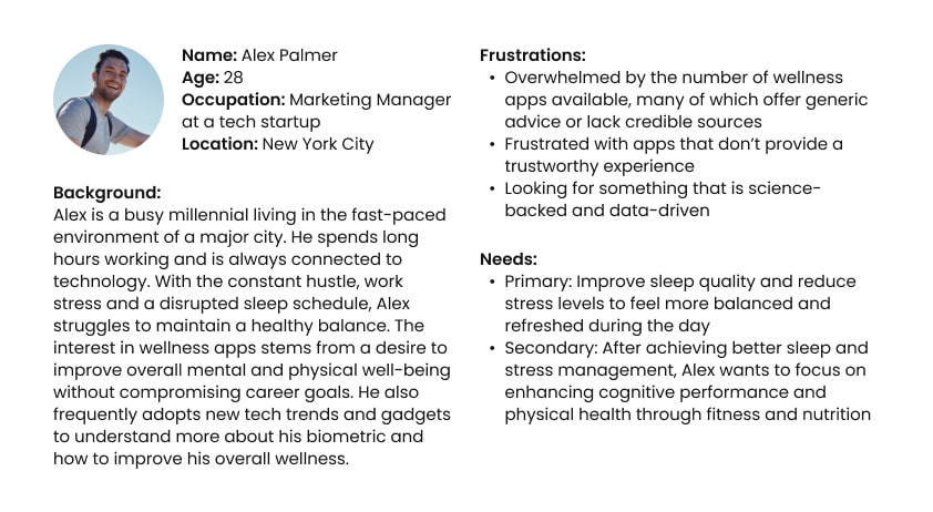
I put together a persona based on the user insights we gathered.
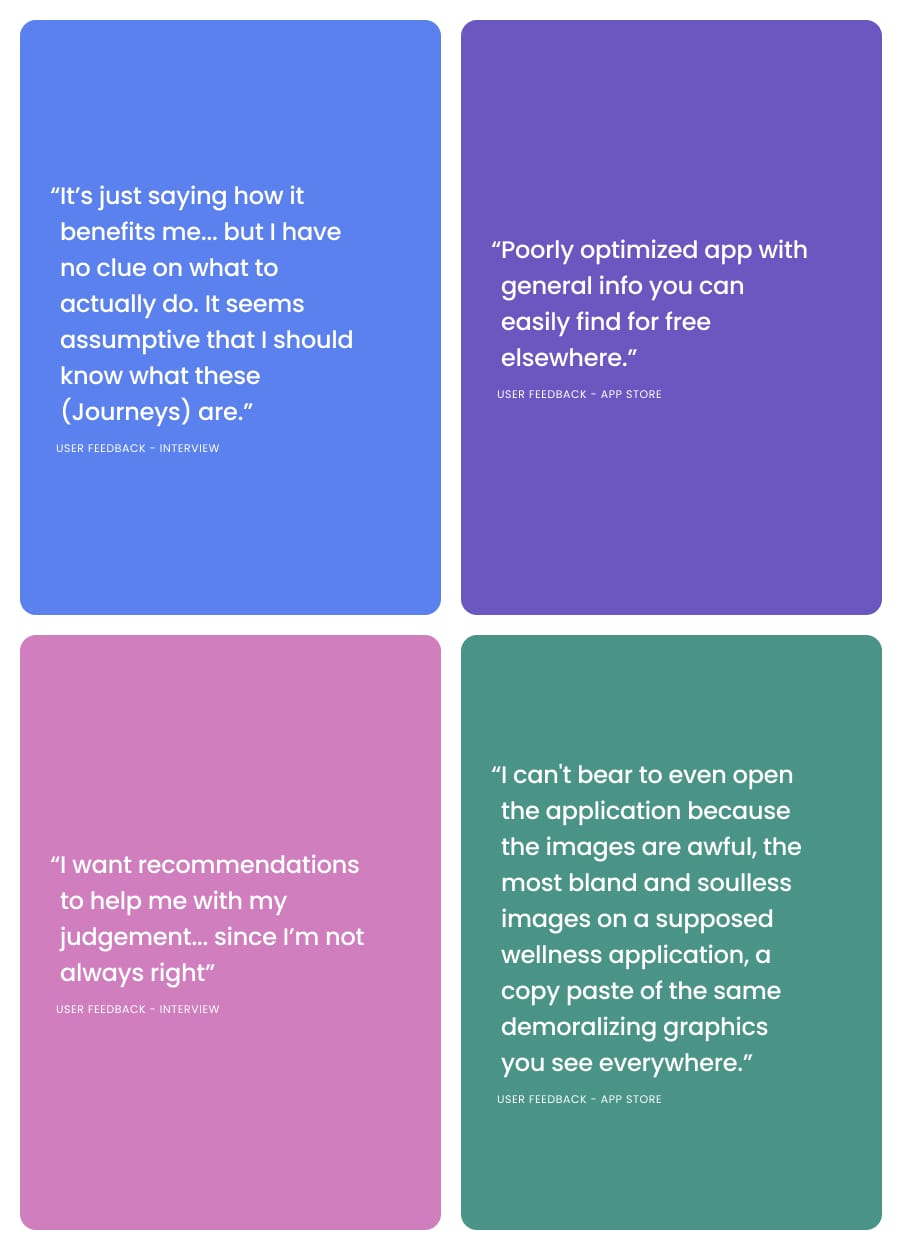
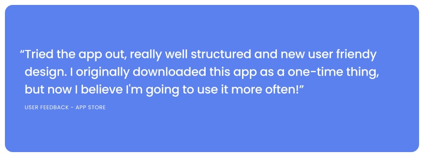
User Feedback
I then gathered the feedback we got from user interviews and from the app store.
To sum up, my findings were:
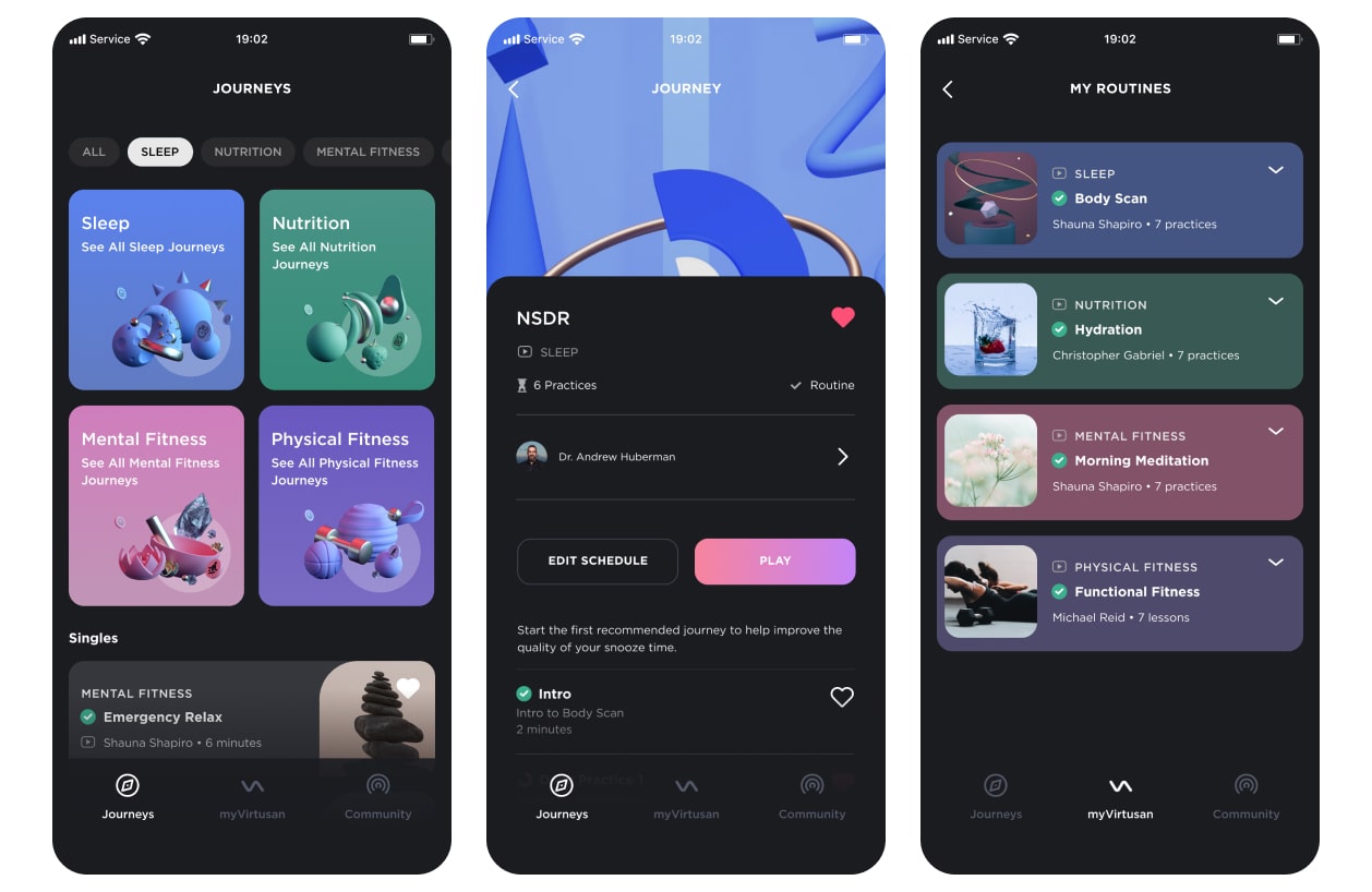
Designing a Solution: Less is More
Virtusan initially offered 38 practices and 10 mini apps (tools), but people were
losing interest shortly after downloading.
Together with the product manager, we deep dived to find out what users were really
using the app for and scaled down to 12 practices.
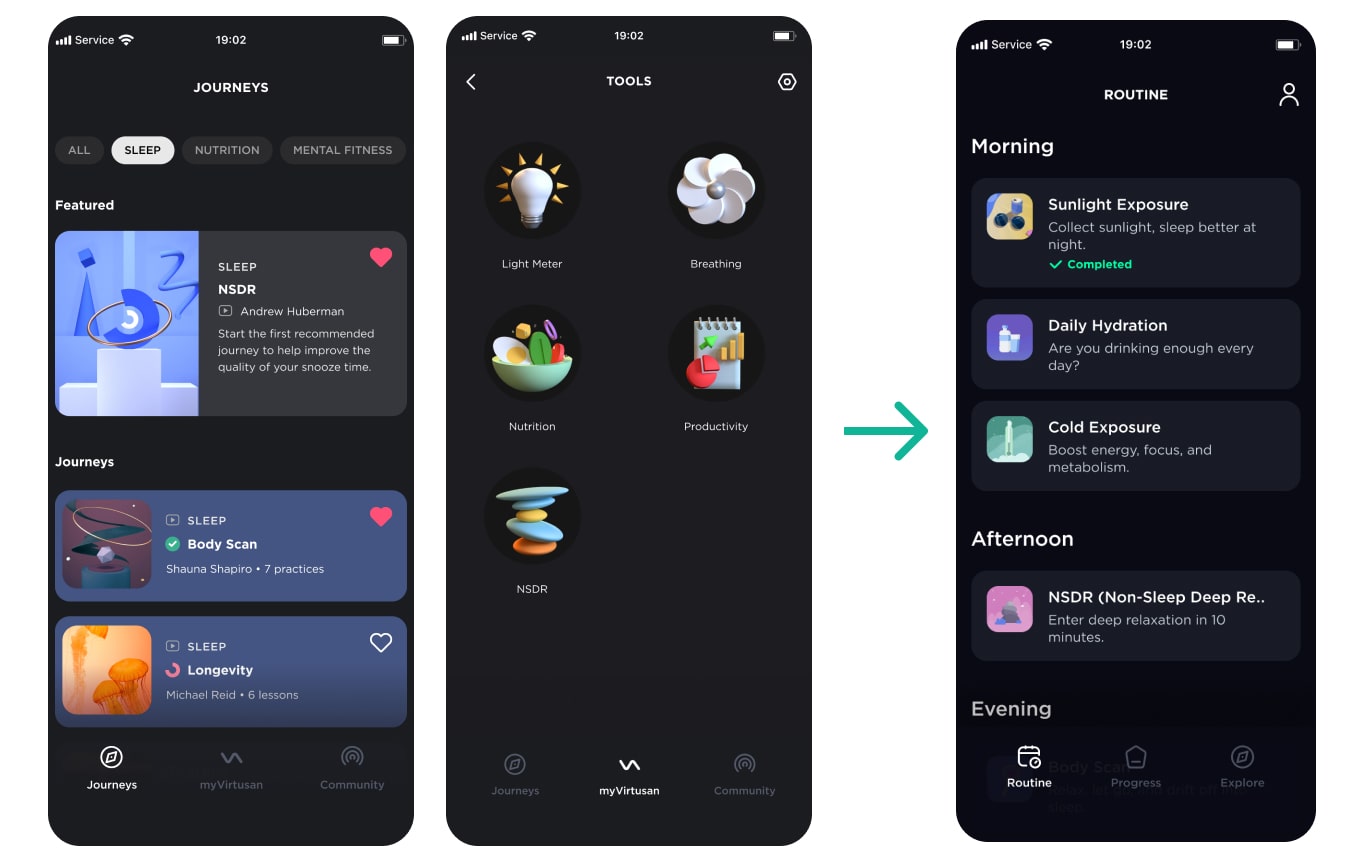
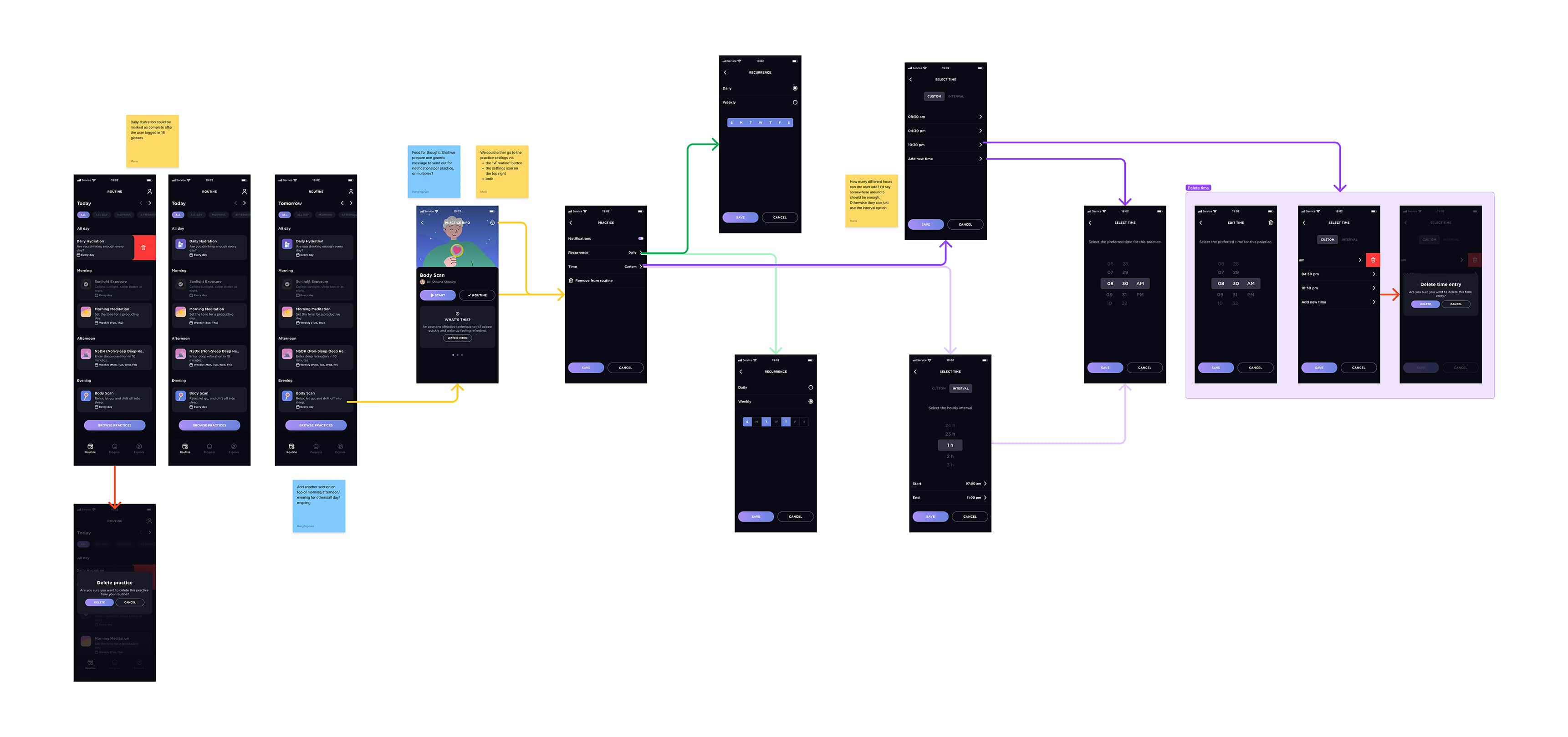
Helping users create their own routine
The next step was to build a system that enables users to easily customise their own
routine based on their favourite practices.
I facilitated a few brainstorming sessions with the team in order to explore potential solutions.
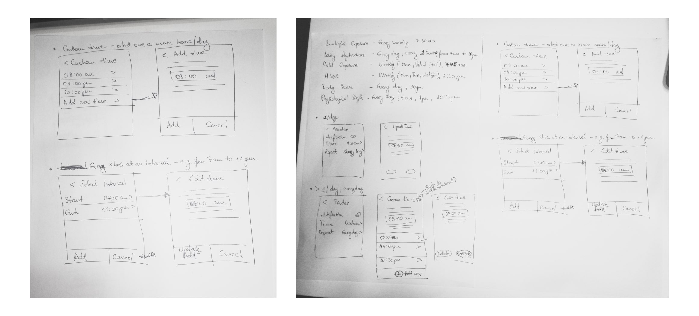
We naturally narrowed down to a solution, so I moved on to high fidelity mockups.
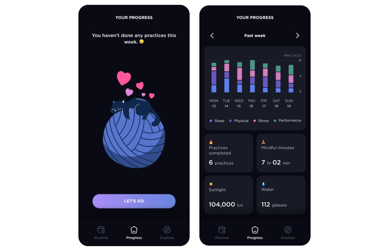
Progress Tracking
In addition to revamping the routine system, I collaborated with the team on a progress
tracking system that would encourage the users to stick to their routines.
The progress tab is an overview of how many practices a user
completes on a daily and weekly basis.
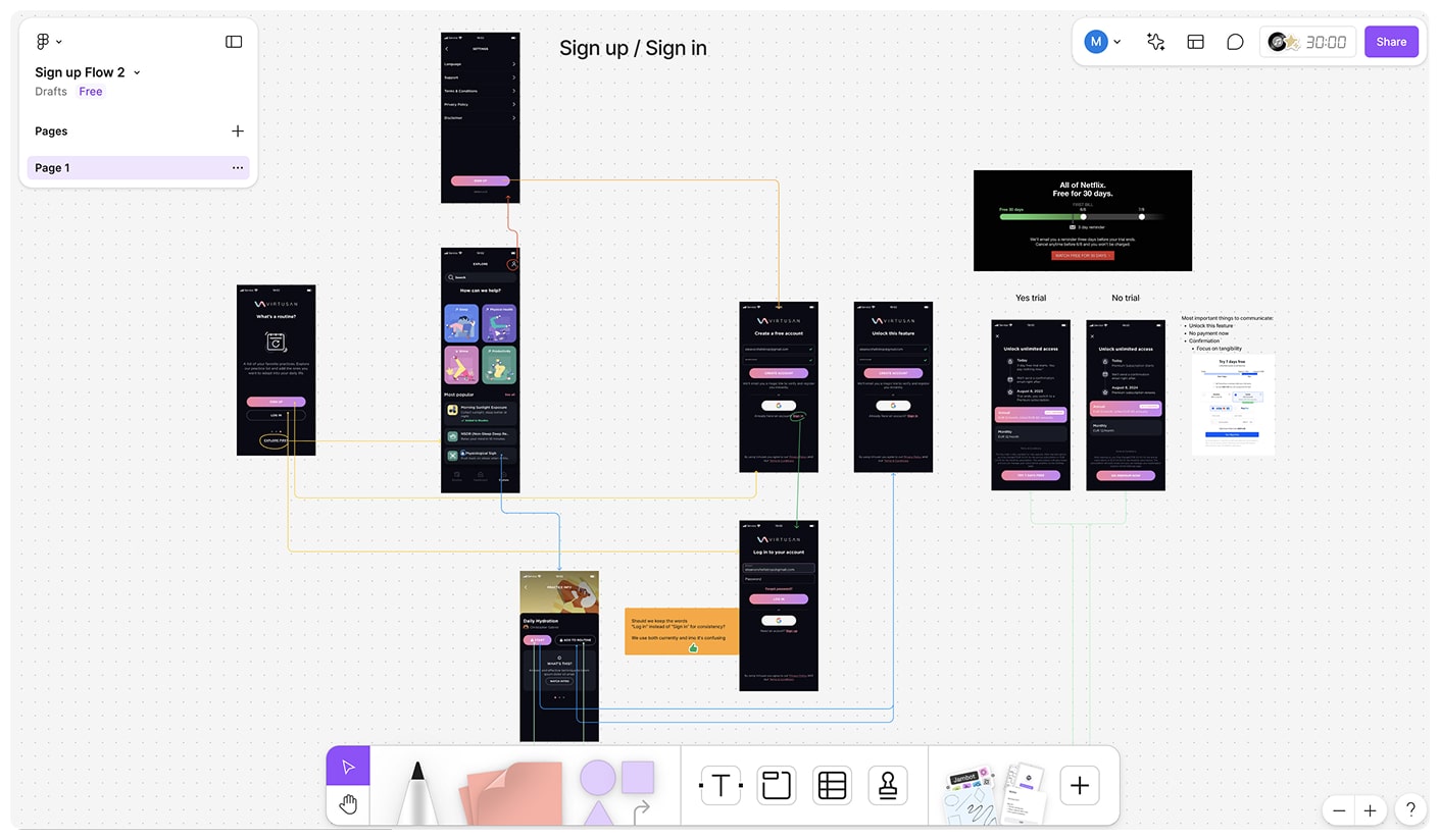
Onboarding Flow
Initially, users were prompted to sign up before accessing the content.
But this discouraged users from signing up. We needed to build trust for users to
sign up and creating an artificial exclusivity through this dark pattern was a bad idea,
especially since this is a wellness app that supposedly helps their users.
So I removed the sign-up requirement on start. To encourage users to buy the full app,
the PM and I brainstormed a Free-to-Premium user flow.
Finishing Touches
I addressed the visual design issues.
On the visual side, I worked closely with a team of graphic designers to create new
illustrations and animations. We liked the idea of each pillar having its own colour,
so we incorporated them in thumbnails and background images.
Also, I collaborated with a supporting UX designer on a new design system, which
included better iconography and taxonomy.
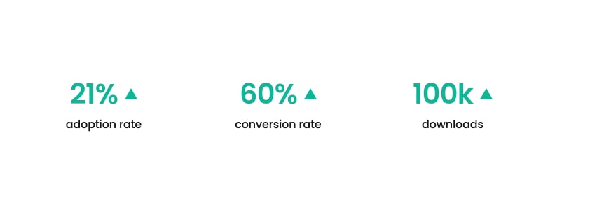
Conclusion
Our hard work resulted in an increase in features used by 21%.
As of January 2024, conversion rate (download-to-trial & download-to-payment) went up
by 60% since the app release.
We also reached 100,000 downloads in 8 months and bumped the average app rating to 4.7 (from 2).
It's easy to jump to high-fidelity prototypes, but it can be counterproductive.
The feedback I received on my early sketches proved to be extremely helpful.
If I were to do this project again, I’d advocate for earlier user testing.
Even a few users could provide valuable insights early on, saving time and money and even gain early adoptees.
I’d also organize the components and styles better and include clear naming.